
DTF Ink Easy Colors: CMYK White Ink Setup Explained 2026
DTF Ink If you’re starting with DTF printing, one thing becomes clear very fast — color control matters a lot. Many beginners struggle with dull prints, incorrect shades, or designs that don’t pop on dark fabrics.
That’s where understanding DTF ink colors explained becomes important.
DTF (Direct to Film) printing uses a combination of CMYK inks and white ink. This setup allows you to print vibrant designs on both light and dark fabrics.
Think of it like painting:
- CMYK = your colors
- White ink = your base canvas
Without white ink, colors won’t show properly on dark surfaces.
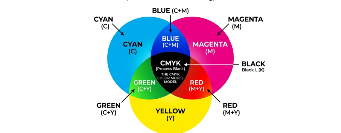
What is CMYK?
CMYK stands for:
- Cyan
- Magenta
- Yellow
- Key (Black)
These four colors mix to create almost every color you see in DTF prints. Let’s break them down.
Cyan
Cyan is a blue-green color.
It helps create:
- Sky blue tones
- Ocean shades
- Cool gradients
Without cyan, your prints will lack depth in cooler tones.
Magenta
Magenta is a strong pink-red color.
It is responsible for:
- Skin tones
- Reds and purples
- Vibrant highlights
If magenta is off, designs can look faded or unnatural.
Yellow
Yellow adds brightness.
It helps with:
- Warm tones
- Gold shades
- Orange colors
Too much yellow can make prints look dull, so balance is key.
Key (Black)
Black ink adds:
- Depth
- Sharp outlines
- Contrast
It is called “Key” because it defines the final detail in the print.

Role of White Ink in DTF
Now comes the most important part of DTF ink colors explained — white ink.
White ink is not just another color. It acts as a base layer.
Why white ink matters:
- Makes colors visible on dark fabrics
- Enhances brightness
- Improves print quality
Without white ink:
- Colors look transparent
- Designs disappear on black shirts
Think of it like painting on a wall:
- White base = primer
- CMYK = final paint
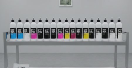
CMYK + White Ink Setup
This is the standard setup in DTF printing.
Printer channel configuration
Most DTF printers use:
- 4 channels for CMYK
- 1–2 channels for white ink
For example, machines using
🔵 ProlificGeeks DTF Printer L1800
or
🔵 XP600
often follow this layout.
Advanced setups like
🔵 i3200
offer better control and faster output.
Layering order (White underbase first)

This is critical in DTF ink colors explained.
Correct order:
- White ink layer (bottom)
- CMYK colors (top)
Why?
Because white ink creates a solid base so colors stay vibrant.
Wrong order = faded or invisible print.
Key Differences: CMYK-Only vs. CMYK + White
| Feature | CMYK Only | CMYK + White |
|---|---|---|
| Fabric type | Light only | Light + Dark |
| Color brightness | Low on dark | High |
| Print quality | Basic | Professional |
| Cost | Lower | Slightly higher |
If you’re serious about DTF, always go for CMYK + White.
File Preparation for CMYK + White

Good printing starts with correct file setup.
Color mode settings
Always use:
- RGB for design
- RIP software converts to CMYK
Avoid designing directly in CMYK — it limits color range.
White layer creation
White layer is created separately.
Ways to do it:
- Automatic (RIP software)
- Manual (Photoshop/Illustrator)
Manual method gives better control.
Resolution and knockouts
- Use 300 DPI for best quality
- Remove unnecessary white areas (knockouts)
This reduces ink usage and improves clarity.
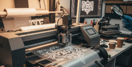
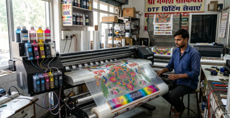
Printing Process Step-by-Step
Here’s a simple workflow based on DTF ink colors explained:

- Prepare design
- Create white layer
- Load film in printer
- Print white layer first
- Print CMYK layer
- Apply adhesive powder
- Cure the film
- Heat press onto fabric
Machines like
🔵 ProlificGeeks Powder Shaker Machine
can automate powder application and curing.
Calibration and Settings
Proper calibration makes a huge difference.
Density adjustments
- Increase density for brighter prints
- Reduce to avoid ink bleeding
Always test before bulk printing.
Choke margins
Choke means slightly shrinking the white layer.
Why?
To prevent white edges from showing.
Recommended:
- 0.1–0.3 mm choke
Spot color options
Spot colors help control white ink areas.
Useful for:
- Logos
- Text
- Sharp edges
Common Issues and Troubleshooting
Even after understanding DTF ink colors explained, problems can happen.
Problem: Colors look dull
Solution: Increase white ink density
Problem: White edges visible
Solution: Adjust choke settings
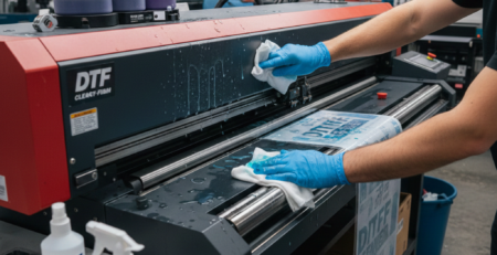
Problem: Ink clogging
Solution: Regular maintenance and cleaning
Problem: Poor adhesion
Solution: Check curing temperature
Best Practices and Tips
Here are some real-world tips:
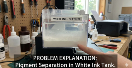
- Shake white ink daily (it settles fast)
- Use high-quality film
- Maintain humidity (40–60%)
- Run test prints every day
- Clean print heads regularly
Using reliable equipment like
🔵 DTFshop Film Rolls
and
🔵 DTFshop Premium Inks
also improves consistency.
Key Takeaways
- CMYK creates colors, white ink creates visibility
- White underbase is essential for dark fabrics
- Proper layering = better results
- File preparation matters as much as printing
- Calibration and maintenance are key
Understanding DTF ink colors explained will save you time, money, and frustration.
Product Suggestions (Used in Article)
🔵 ProlificGeeks DTF Printer L1800
🔵 XP600
🔵 i3200
🔵 ProlificGeeks Powder Shaker Machine
🔵 DTFshop Film Rolls
🔵 DTFshop Premium Inks
External References + Credits
- PrintIndustry.com
- Fespa.com
- InkJetInsights.com
- ResearchGate
Credit: Information references from Fespa, PrintIndustry, and other public sources.

LEAVE A COMMENT